
What Makes a Landing Page Actually Convert?
You’re running ads. Traffic is coming in. But visitors land on your page and leave without doing anything.
This isn’t a traffic problem. It’s a landing page design problem, and it’s more common than most businesses realise.
The average landing page conversion rate across industries ranges from 2% to 5%. But pages that are strategically designed and continuously optimised consistently convert at 10–20% or higher. That gap isn’t luck. It’s the result of applying the right elements in the right way.
This guide breaks down the 17 non-negotiable elements of a high-converting landing page the ones that eliminate doubt, create desire, and make it easy for a visitor to say yes.
Frequently Asked Questions About Landing Pages
Before diving into the elements, here are the questions people most commonly search for on this topic answered directly.
What is a landing page?
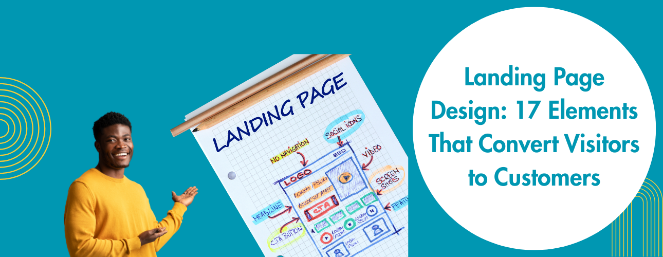
A landing page is a standalone web page designed for a single purpose: to convert a visitor into a lead or customer. Unlike a homepage, it has no navigation distractions and is built around one specific offer or action.
What is a good landing page conversion rate?
Industry averages sit around 2–5%. Optimised, well-designed pages routinely achieve 10–20%. Anything above 10% is considered high-performing.
How many elements should a landing page have?
There is no fixed number, but every element must serve the single conversion goal. More features do not equal more conversions; focus and clarity do.
What is the most important element of a landing page?
The headline is often cited as the single most important element because it determines whether a visitor stays or leaves within the first three seconds.
What makes a landing page fail?
The most common reasons include: a weak or unclear headline, mismatched messaging between ad and page, too many competing goals, slow load speeds, and insufficient trust signals.
The 17 Elements of a High-Converting Landing Page
1. A Headline That Stops the Scroll
The headline is the first thing a visitor reads. It has approximately three seconds to earn their attention or lose it.
A high-converting headline does not lead with your brand name or a clever tagline. It speaks directly to a pain point the visitor already has, or the specific outcome they want.
Weak headline: “Welcome to Our Platform”
Strong headline: “Stop Losing Leads. Start Converting Them — Automatically.”
The best headlines are clear, specific, and benefit-driven. They tell the visitor exactly what they get and why it matters to them.
2. A Subheadline That Adds Essential Context
The subheadline has one job: to support and expand on what the headline promises. It answers the “how” question, briefly explaining the mechanism behind the main promise.
Keep it to one or two lines. Avoid vague language. The subheadline should make the visitor want to keep reading, not explain your entire service offering.
3. One Single, Focused Goal
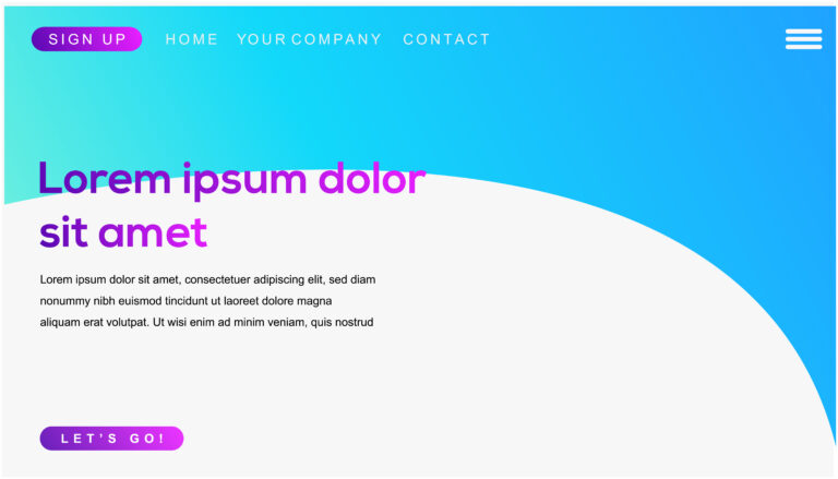
This is the element most businesses get wrong. Every high-converting landing page is built around a single action. Not three, not five, one.
If you have navigation links, a blog section, multiple CTAs pointing to different pages, and a “Check Our Services” button, you have a homepage, not a landing page. Every additional option you give a visitor reduces the likelihood they’ll take the action you actually want.
Landing page optimisation begins with ruthless simplification. Remove anything that does not serve the one conversion goal.
4. A Hero Image or Video That Resonates
Visuals influence emotion before logic processes anything. The hero image or video at the top of your page sets the tone and communicates identity within milliseconds.
Use visuals that reflect your audience, show your product or service in use, or illustrate the transformation your offer delivers. Generic stock photography sends the wrong signal; it communicates that no serious thought went into this page.
Short videos (60–90 seconds) showing a product demo, a testimonial, or a problem-solution narrative can significantly increase time-on-page and conversion rates.
5. A Value Proposition That’s Impossible to Ignore
Your value proposition answers three questions at once: Why you? Why now? Why should I care?
It needs to appear above the fold, visible without scrolling, and communicate your unique advantage in plain, direct language. If you can substitute a competitor’s name for yours and the value proposition still works, rewrite it. It needs to be specific to what you offer and who you serve.
6. Social Proof That Builds Instant Trust
People trust other people more than they trust brands. Social proof is the element that bridges that gap.
Effective social proof includes:
- Client testimonials (specific, with names and results where possible)
- Star ratings and review counts
- Case study snippets showing before-and-after outcomes
- Logos of recognised clients or publications
- User numbers (“Trusted by 2,400+ businesses”)
Specificity matters more than volume. One detailed testimonial that says “We generated 47 leads in 30 days using this system” outperforms ten vague “Great service!” quotes every time.
7. A CTA Button That Demands Action
The call-to-action is the tipping point of the entire page. A weak CTA is one of the most common and invisible killers of landing page conversion rates.
Avoid generic labels:
- “Submit”
- “Click Here”
- “Learn More”
Use action-plus-benefit phrasing instead:
- “Get My Free Audit”
- “Start Growing Today”
- “Download the Guide Now”
- “Book My Free Strategy Call”
Button colour, size, and placement all matter. The CTA should visually stand out from everything else on the page. It should be visible without scrolling, and repeated further down the page for longer formats.
8. A Lead Capture Form With as Few Fields as Possible
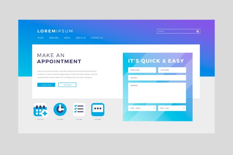
If your goal is lead generation, the form is the conversion point. Every field you add creates friction and reduces the likelihood that a visitor will complete it.
Landing page best practices are consistent on this: fewer fields equal higher conversion rates. Start with name and email only. Add phone number or other details only if they are operationally necessary. If you need more information, collect it after the initial conversion, not as a prerequisite to it.
9. Benefit-Focused Copy, Not Feature Lists
Features describe what something is. Benefits describe what it does for the person reading.
Feature: “24/7 customer support”
Benefit: “Get help the moment you need it, no waiting days for an email back”
Feature: “AI-powered analytics dashboard”
Benefit: “Know exactly which campaigns are making you money and which ones are wasting your budget”
Your landing page copy should consistently answer the reader’s unspoken question: “What does this mean for me?” Write about outcomes. Write about the transformation. Make it about them, not you.
10. Urgency and Scarcity Above the Fold
Urgency is one of the oldest and most reliable conversion triggers in marketing. Countdown timers, limited availability notices, and deadline-based offers reduce hesitation and push fence-sitters toward action.
The keyword is “honest.” Manufactured urgency timers that reset when the page refreshes, fake “only 3 spots left” claims destroy trust permanently. Use urgency only when it reflects a real constraint: a genuine deadline, an actual capacity limit, or a time-sensitive offer.
11. Trust Badges and Security Signals
For any page that collects personal information or processes payment, anxiety spikes at the moment of commitment. Trust signals reduce that anxiety directly.
These include:
- SSL certificate badge (“Secure Checkout” or padlock icon)
- Money-back guarantee statements
- Privacy policy link (“We never share your data”)
- Payment security icons (Visa, Mastercard, PayPal logos)
- Industry certifications or accreditations
These elements do not need to dominate the page. They simply need to be present and visible near the form or CTA.
12. Mobile-First Design
More than 60% of global web traffic now comes from mobile devices. If your landing page was designed for desktop and adapted for mobile as an afterthought, you are losing more than half your potential conversions.
Mobile-first landing page design means:
- Fast load times on 4G and 5G connections
- Thumb-friendly CTA buttons (minimum 44x44px tap target)
- No horizontal scrolling
- Readable text without pinching or zooming
- Forms that auto-trigger the appropriate keyboard (numeric for phone fields, email keyboard for email fields)
13. Page Speed as a Conversion Factor
A one-second delay in page load time reduces conversions by approximately 7%. When you are running paid traffic where every click costs money, slow pages are not a technical inconvenience. They are a direct drain on ROI.
Core optimisation steps:
- Compress all images (use WebP format where possible)
- Minimise JavaScript and CSS files
- Use browser caching
- Choose fast, reliable hosting
- Use a CDN for geographically distributed audiences
Google’s Core Web Vitals, Largest Contentful Paint (LCP), First Input Delay (FID), and Cumulative Layout Shift (CLS) are now direct ranking factors. A faster page ranks better and converts better simultaneously.
14. A Logical Visual Hierarchy
Good landing page design guides the eye without the visitor realising it. From headline to hero visual, to supporting benefits, to social proof, to CTA, each section should flow naturally into the next.
Visual hierarchy is created through:
- Size contrast (larger elements for more important content)
- Colour contrast (CTA buttons should stand out)
- White space (breathing room reduces cognitive load)
- Directional cues (arrows, human eye lines, and layout flow all guide attention)
If someone has to hunt for the next step or figure out what to do, you have already lost them.
15. An Objection Handling Section
Every visitor arrives with doubts. “What if this doesn’t work for me?” “Is it worth the money?” “How complicated is this going to be?”
The mistake most landing pages make is ignoring these questions and hoping the visitor will push through. High-converting pages address objections directly.
This can be done through:
- An FAQ section that pre-empts the most common hesitations
- Guarantee statements (“If you’re not satisfied within 30 days, you get a full refund”)
- Reassurance copy near the CTA (“No contracts. Cancel anytime.”)
- Process transparency (“Here’s exactly how it works in 3 steps”)
Reducing doubt is one of the most underrated and highest-leverage aspects of landing page optimisation.
16. Message Match Between Your Ad and Your Page
Message match is the alignment between what your ad promises and what your landing page delivers. It is a critical and frequently overlooked conversion factor.
If your ad says “Get a Free Website Audit” and your landing page headline says “Transform Your Digital Presence,” you have created a disconnect. The visitor arrived expecting one thing and found something slightly different. That moment of confusion, even a subtle one, breaks trust and increases bounce rate.
The headline, subheadline, and opening copy of your landing page should directly mirror the language of the ad or email that drove the click. Same language, same offer, same energy.
17. An A/B Testing Infrastructure
Even the most thoughtfully designed landing page is a hypothesis. The teams that achieve the highest conversion rates treat landing page optimisation as a continuous process not a one-time event.
A/B testing (also called split testing) means running two versions of a page simultaneously to measure which performs better. Test one variable at a time:
- Headline copy
- CTA button colour or text
- Hero image or video
- Form placement (top vs. bottom of page)
- Urgency elements
- Social proof format
Small improvements compound. A 3% lift in headline performance and a 2% lift in CTA placement can meaningfully shift overall conversion rates over time. Set up testing infrastructure from the start rather than trying to retrofit it later.
What Is the Ideal Structure for a Landing Page?
Based on conversion data and best practices, a high-performing landing page structure typically follows this order:
- Header – Logo (minimal), single CTA button
- Hero section – Headline, subheadline, hero image/video, primary CTA
- Value proposition – Why this offer, why now
- Social proof – Testimonials, client logos, review scores
- Benefits section – Outcome-focused copy with supporting visuals
- How it works – Three-step process or simple explainer
- Objection handling / FAQ – Address the top hesitations
- Final CTA – Repeated with reinforced trust signals
- Footer – Privacy policy, contact link (minimal)
Every section exists to move the visitor one step closer to the single conversion goal.
How Long Should a Landing Page Be?
Landing page length should match the complexity and price point of the offer.
- Short pages (1–3 scrolls): Best for free lead magnets, low-commitment offers, or audiences already familiar with the brand. Example: “Download our free guide.”
- Medium pages (4–7 scrolls): Suitable for mid-ticket services or offers that require some explanation. Example: A free strategy call for a £500/month service.
- Long pages (8+ scrolls): Appropriate for high-ticket offers, complex services, or cold audiences with no prior awareness. Every scroll must earn its place.
The rule is simple: the page should be exactly as long as it needs to be to answer every remaining question a qualified visitor might have before converting.
Landing Page Design for UAE Businesses: Specific Considerations
For businesses targeting audiences in the UAE and GCC, a few additional factors apply:
Language and localisation: If your audience includes Arabic speakers, consider whether a bilingual page or an Arabic-only version is appropriate. Right-to-left layout requires specific design treatment.
WhatsApp as a CTA: In the UAE, WhatsApp is the dominant business communication channel. Including a “Chat on WhatsApp” CTA alongside or instead of a traditional form can significantly increase conversion rates for local audiences.
Trust signals relevant to the region: References to UAE-based clients, local certifications, or membership in UAE business associations carry more weight with regional audiences than generic global badges.
Payment and contact expectations: UAE audiences often prefer direct phone contact or WhatsApp over email forms. Including a phone number prominently, especially a UAE-registered number, builds local credibility.
Final Thoughts: Landing Page Design Is a System, Not a Template
A landing page is not a digital brochure. It is a conversion machine, and every element on it should justify its presence by moving a visitor toward a single decision.
Getting the 17 elements right is not a one-time project. It is an ongoing discipline. The most successful businesses treat their landing pages as living assets: testing, iterating, and improving continuously based on real data.
Get the elements right, and the conversions follow. Get them wrong, and no amount of traffic budget will save you.
About Go Creative Circle
Go Creative Circle is a full-service digital marketing agency based in the UAE, built for businesses that want measurable results not just deliverables.
We design and build landing pages that are engineered to convert: from strategy and copy to design, development, and post-launch optimisation. Every page we build is built around your specific audience, your offer, and your conversion goal.
Our services extend across the full digital growth stack:
- Website Development – Fast, responsive, and built to perform across every device and search engine
- SEO – Technical, on-page, and off-page optimisation that builds sustainable organic visibility
- Social Media Management – Strategic content and community management that builds real audiences
- Performance Marketing – Data-driven paid campaigns across Google, Meta, and beyond
- Branding – Identity design and visual systems that make your business instantly recognisable
Whether you’re a growth-stage startup or an established brand ready to scale, we bring the strategy, creativity, and execution to make it happen.
Ready to build a landing page that actually converts?
Contact Go Creative Circle